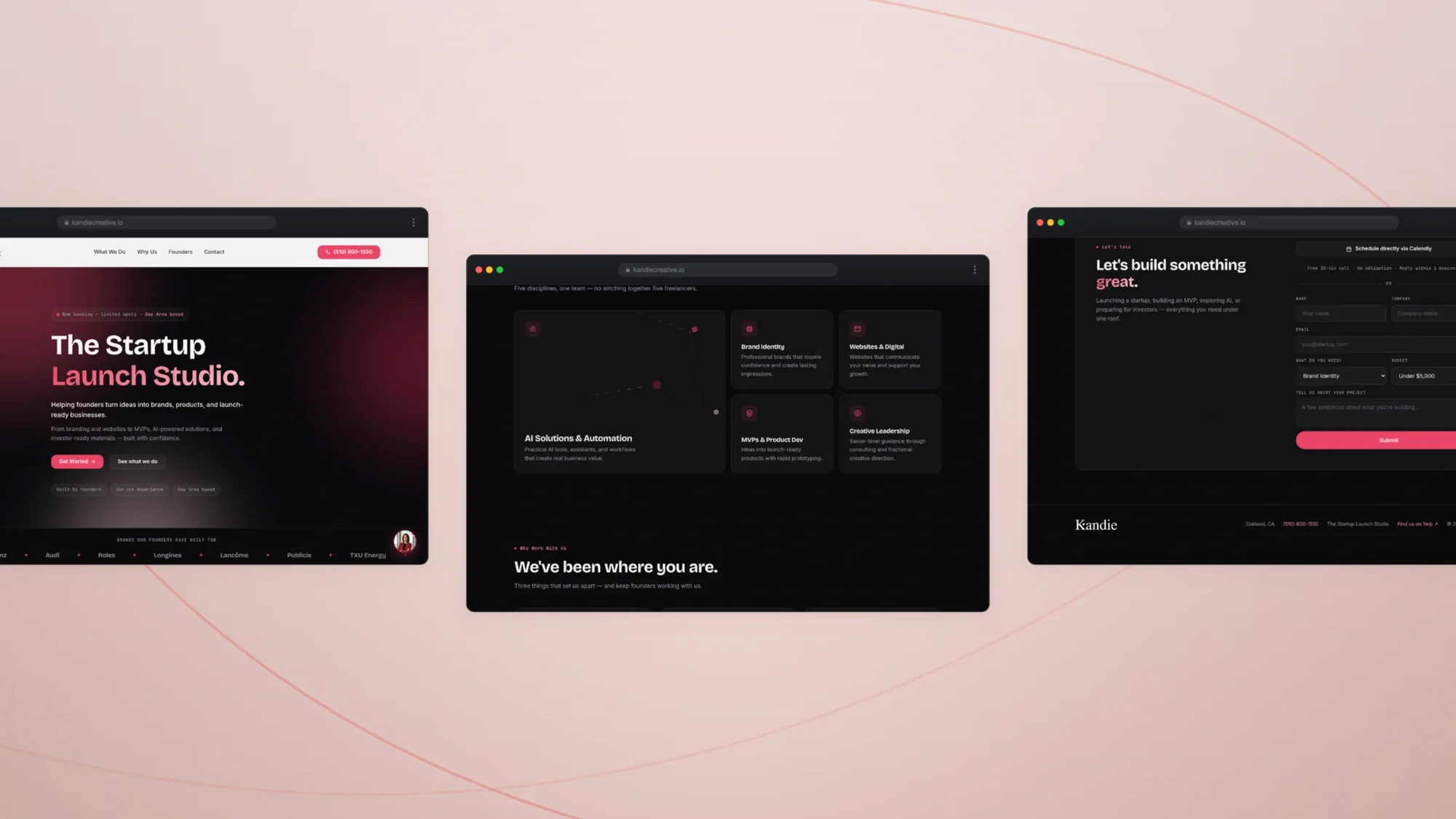
Kandie Creative is a studio I co-founded that pairs consulting with product — building the AI tools, strategy frameworks, and automation systems that early-stage founders otherwise have to assemble themselves.
Early-stage founders are asked to do brand, positioning, operations, and product at once, usually before they can afford anyone to help. Agencies solve one slice expensively; templates solve none of it well.
Kandie exists in that gap — a studio where the strategy work and the tooling that operationalises it are built by the same people.
Approach
The studio runs on proprietary tools rather than decks. Frameworks for brand and business strategy are encoded into products founders can actually use, and the automation systems behind them handle the operational work that would otherwise need a hire.
What we build
01Proprietary AI tools for validating ideas and pressure-testing positioning.
02Brand and business strategy frameworks, delivered as working systems.
03Automation that streamlines operations from day one.
04The identity and product design across everything the studio ships.
Cherry #EF4161Wine #641F2DInk #0A0A0CBone #F7F6F2
The logo
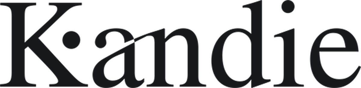
The wordmark on bone and on the near-black the site runs in. The cherry dot is the one element that never changes value — it is the fixed point the rest of the logo is set against.
Logo / light
Logo / dark
The symbol
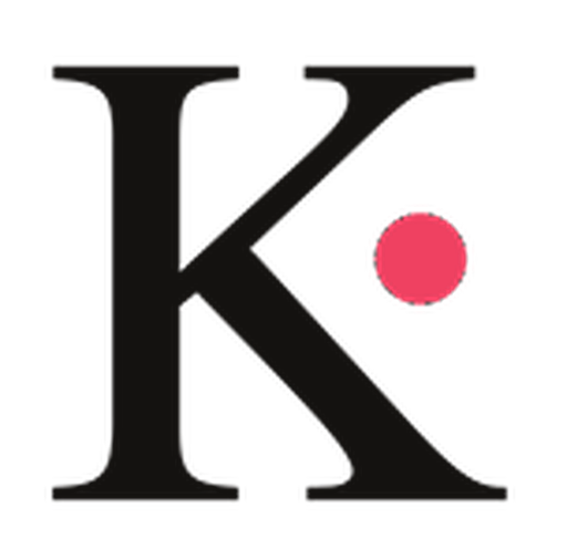
The K and its dot, pulled out of the wordmark and set on the grid. This is the form that goes on a favicon, an avatar, and the chat bubble Cherry answers from.
Primary
Reversed
One colour
The mark
The capital K with a cherry dot set into its counter — the one piece of the wordmark that works alone. It is the only colour in the logo, which makes it the part that survives at sixteen pixels.
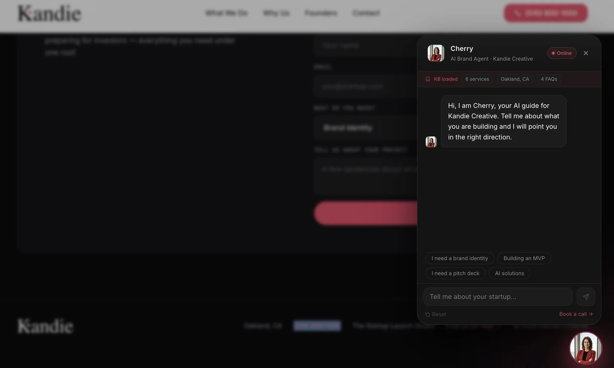
It is also where the AI agent built into the site got its name. Cherry answers questions in the corner of every page, and the mark she is named after sits in the header above her — the identity and the product using one object for two jobs.
The wordmark
A high-contrast serif with the hairlines left hair-thin, set lowercase after the capital. It reads closer to a fashion house than a software studio, which is the point: the work is brand and strategy before it is code.
Most startup studios set their name in the same geometric sans as the companies they advise, which makes the advice look like the product. The serif puts distance between the two — the studio is the editorial voice, not another tool in the stack.
The palette
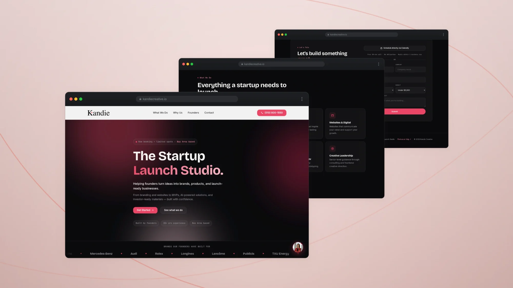
Cherry against near-black, with wine carrying the gradients in between. Bone is the only light surface — used where the page needs to breathe, never as a background.
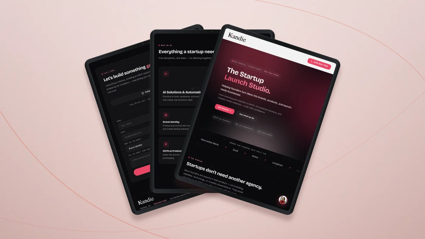
The dark ground is doing positioning work, not just aesthetics. A studio selling to founders has to look like it ships software, and the near-black sections let the cherry accents behave like interface rather than like brand colour.
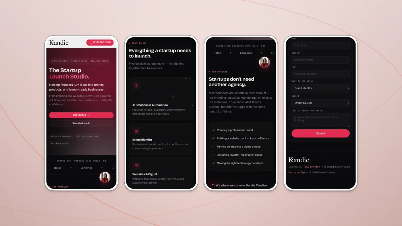
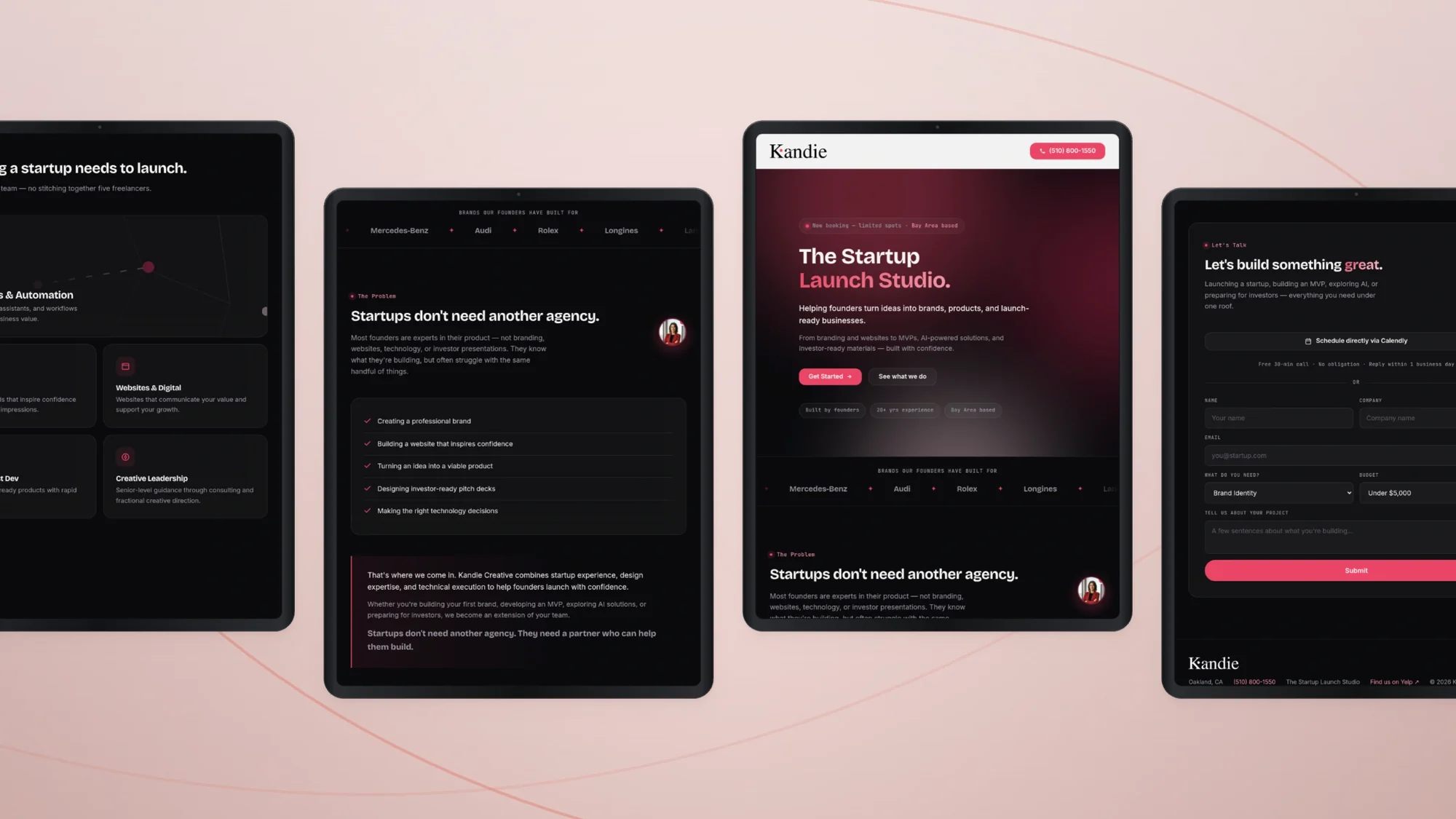
The launched site — desktop, mobile, and Cherry, the AI brand agent
Strategy that ships as a tool beats strategy that ships as a deck.