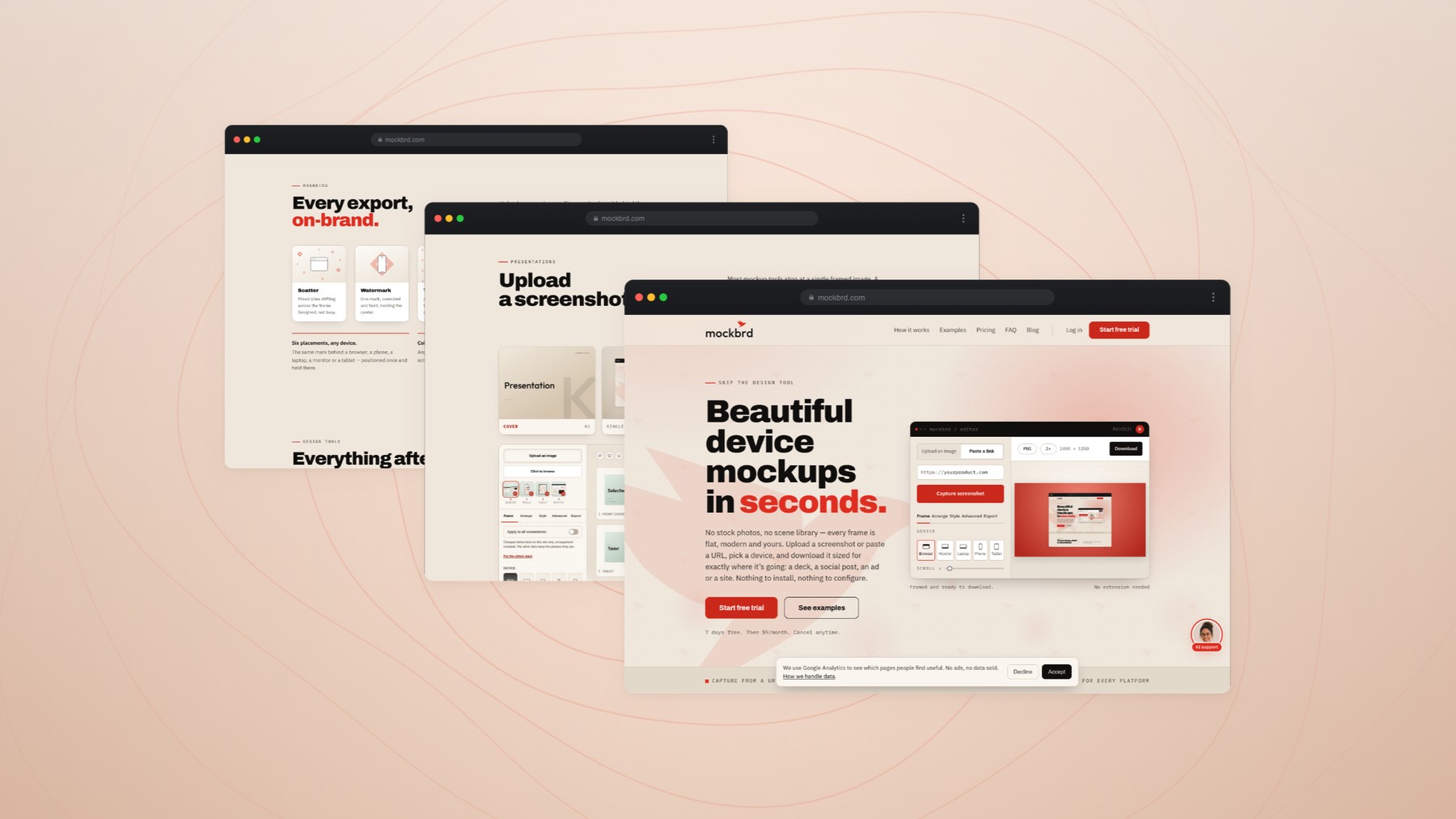
mockbrd turns a screenshot into a finished device mockup in about the time it takes to describe one. I designed the brand and the product, then built and shipped the whole thing — the marketing site, the studio editor, the rendering engine, the accounts and the billing.
Anyone shipping work has to show it on a screen — a pitch deck, a portfolio page, a launch post, an ad. Doing that properly means opening a design tool, finding a frame, fitting the screenshot, matching the background, exporting at the right size. It is twenty minutes of work that has nothing to do with the thing being shown, and it gets repeated for every image.
The tools that exist solve one half: either a template library with no product behind it, or a design app that assumes you already know how to use one.
Approach
Build the whole loop and keep it in the browser. Paste a URL or drop an image, pick a device, and the frame, the ground and the export size are already decided — with every one of them still open if you want to change it.
The constraint I held to throughout: the core loop stays free of ceremony. Upload, frame, style, download never asks you to configure anything first, and never asks you to upgrade to finish what you started.
What I built
01The brand — mark, wordmark, and a cream, ink and red palette that carries from the site into the product.
02The marketing site, written and designed around four audiences: designers, agencies, founders and marketers.
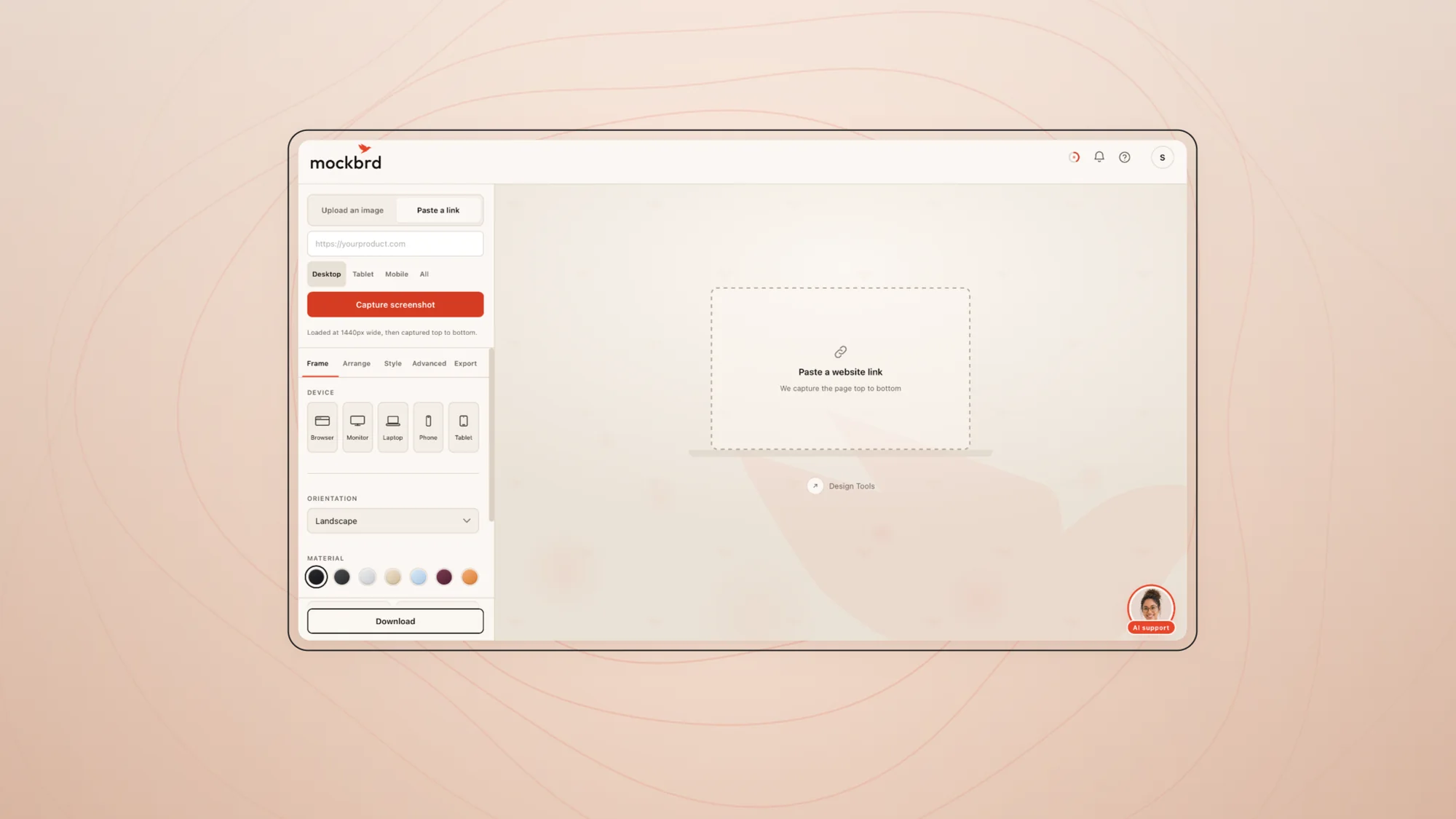
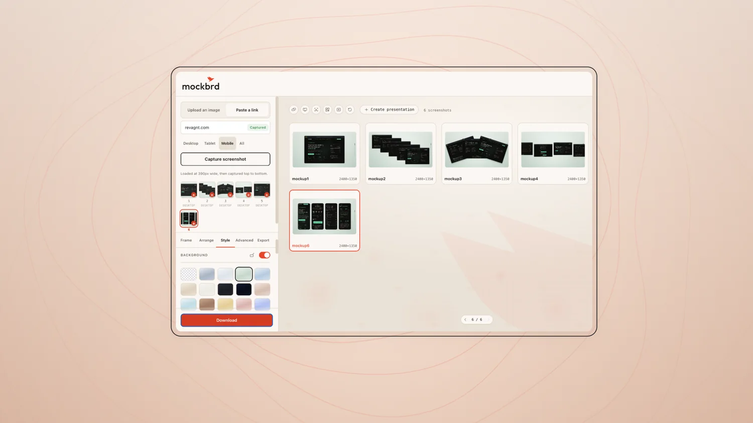
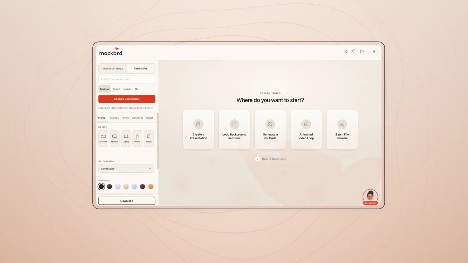
03The studio — real device frames rendered procedurally, with frame, arrange, style and export as four panes rather than one long form.
04The backend: URL capture, rendering, accounts, Google sign-in, Stripe subscriptions and a seven-day trial.
Red #E8452CCream #F2EBE3Sand #E7D7CAInk #141210
The logo
Applied across the two grounds the product actually lives on — the cream of the marketing site and the ink of the app. The bird keeps its red in both; only the wordmark changes value.
Logo / light
Logo / dark
The symbol
The bird on its own, drawn on the grid it was built to. Every angle in it is a multiple of fifteen degrees, which is what keeps the silhouette readable once it drops below twenty pixels.
Primary
Reversed
One colour
The mark
A bird cut entirely from straight lines — a notch for the wing, one hard diagonal for the tail. Nothing in it curves, which is what lets it survive being sixteen pixels wide in a browser tab and a metre wide across the top of the site.
It also had to work as a cursor, a loading state and a favicon before any of it was drawn, so the silhouette carries the whole identity on its own. Remove the word and the bird still reads as the product.
The wordmark
Lowercase, geometric, tightly set, with the bird riding above the last letters rather than standing beside the name. The two read as one shape before they read as two.
Dropping the vowel in “mockbrd” was a naming decision, but it became a typographic one: five consonants in a row give the wordmark an even rhythm and no awkward gap for the bird to sit over. The name sets at any size without tracking adjustments.
The palette
Cream and ink, and exactly one red. The red is never decoration — it marks the thing you are meant to click, which is why the product can use it as the only accent and still feel ordered.
Sand sits between the two as the surface colour for anything held back: empty states, disabled controls, the ground behind a mockup. Three neutrals and one signal is the whole system, and it holds across the marketing site and the app without a second ruleset.
01
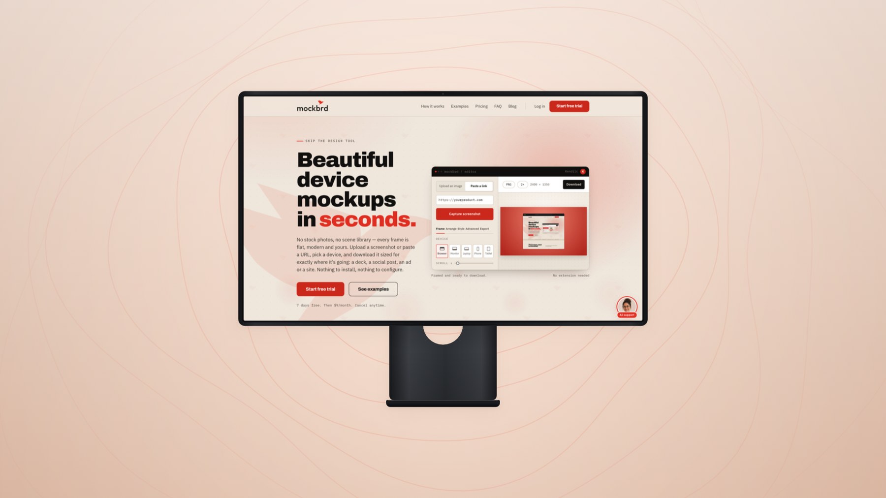
The promise, and the product behind it
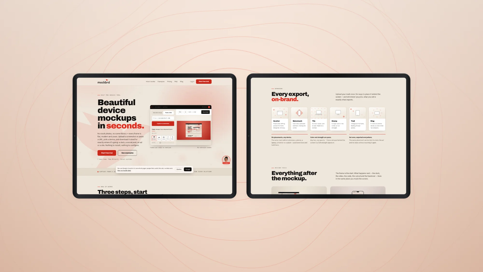
One line, no hedging — and the editor itself sitting right beside it, already mid-job. The hero shows the product rather than describing it, because the entire pitch is that this takes seconds.
02
The page as a system
Branding, examples, FAQ and the closing call to action, each built from the same three ingredients: cream ground, ink type, one red. Nothing is styled for its own section.
03
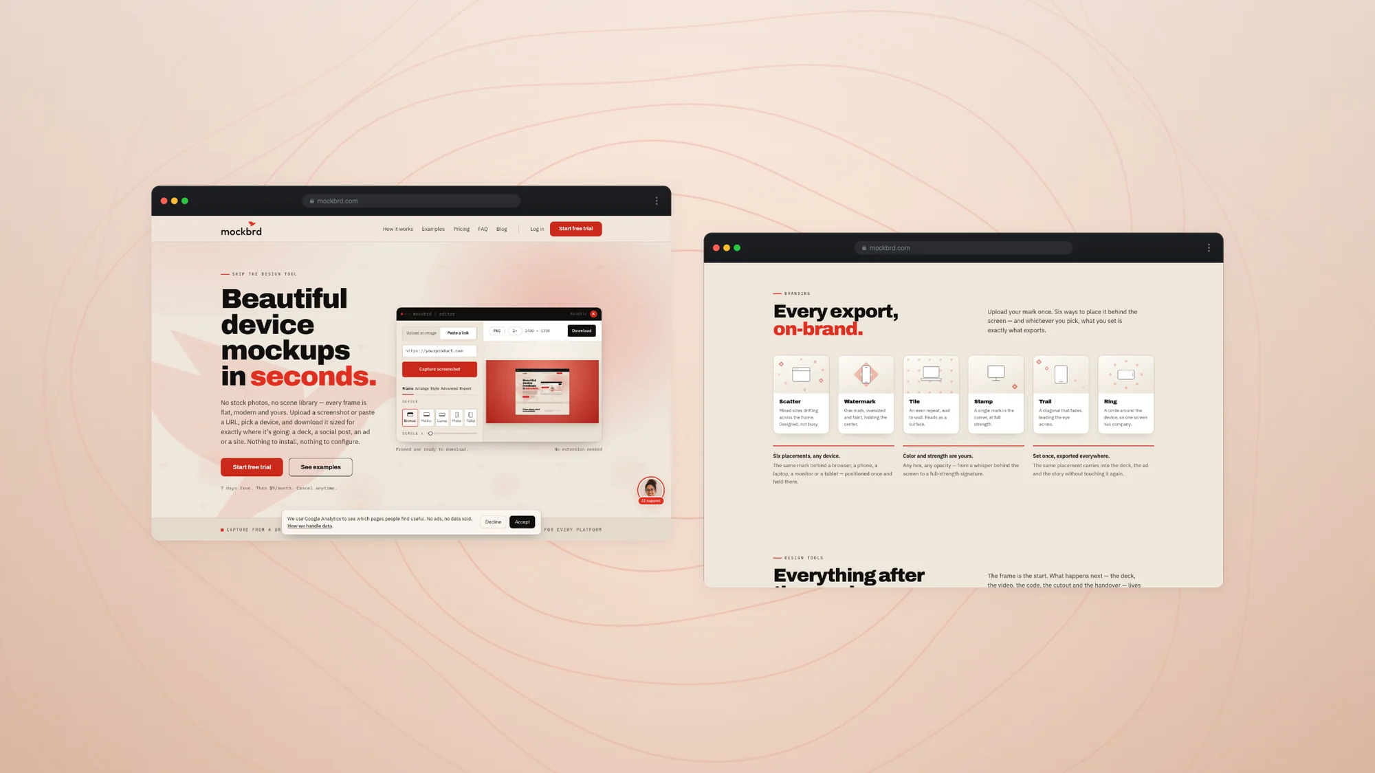
Two pages, one grammar
The homepage and the branding page side by side. Different content, identical rhythm — the same measure, the same spacing, the same single accent.
04
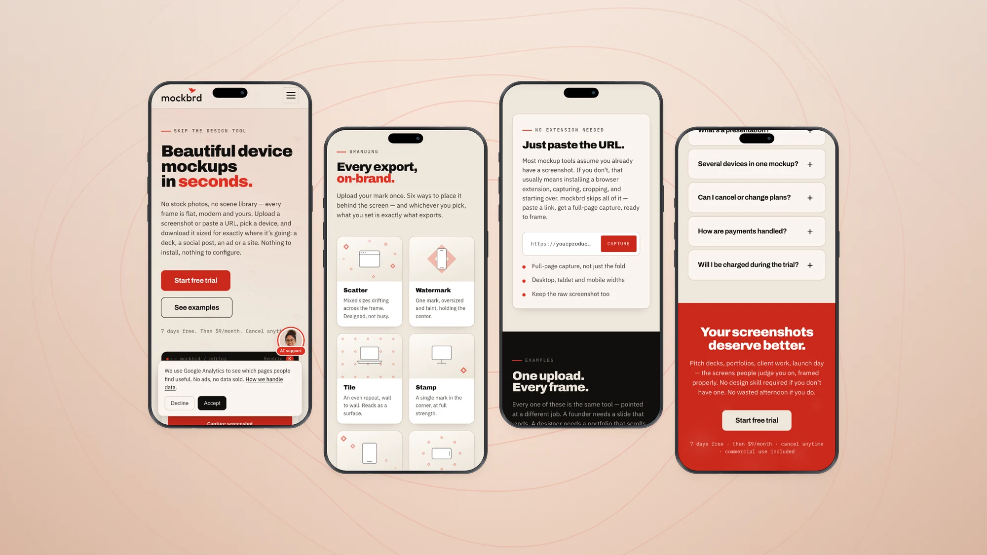
And on a phone, where most of it is actually seen
The whole thing was laid out so the mobile version is the same argument at the same pace, not a shortened one.
Every frame on this page was made in mockbrdThe Studio
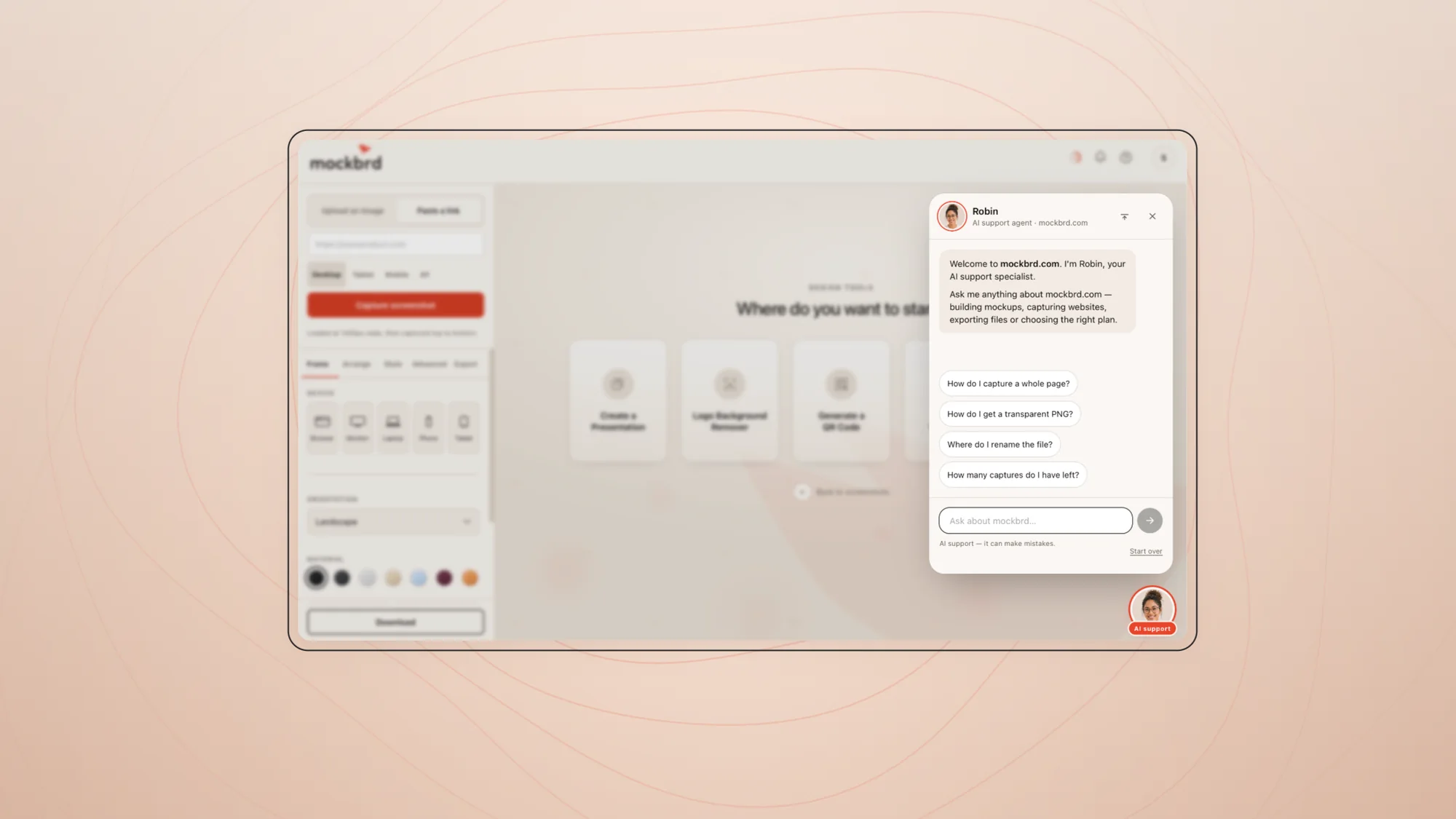
The canvas opens empty and says exactly what to do next. Paste a link; the page is captured top to bottom.01One URL, every breakpoint, six finished frames — the batch is the point.02The jobs that always sit next to a mockup, kept in the same place as the mockup.Robin answers in the corner of the product rather than in a help centre nobody opens.
The product itself — brand, interface and build
Designing the product and building it are the same job when you are the one shipping it.