Branding AI sales automation without the revenue promise
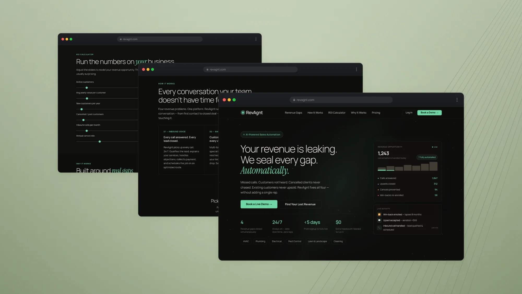
RevAgnt answers the calls a home service business misses, chases the quotes nobody followed up, and wins back the customers who quietly stopped booking. I built the identity and the messaging, and designed a landing page that demonstrates the product rather than describing it.
Home service companies lose revenue in four places that look like nothing from the inside: calls that ring out, customers who are heard but not listened to, cancellations nobody chased, and existing customers nobody ever sold a second thing to. None of it shows up as a bad month. It shows up as a business that never quite grows.
The category that sells into this problem has a credibility issue. Every competitor leads with a revenue number, and every operator has heard that number before.
Approach
Two decisions shaped the whole thing. First, every revenue claim came out and was replaced with a statement about what the product actually does — the page argues from capability, not from a figure a prospect has already learned to discount.
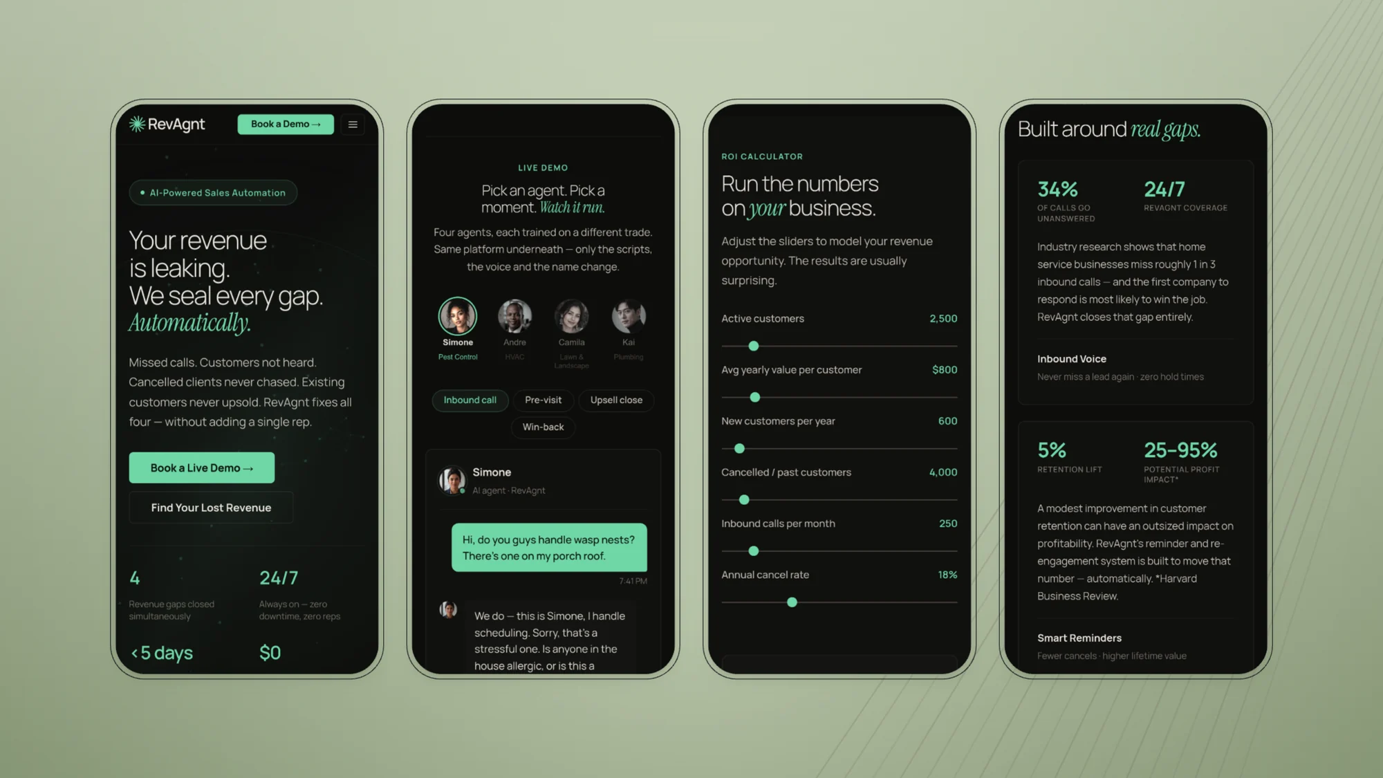
Second, the page demonstrates instead of describing. A live four-agent conversation runs in the hero: pick a trade, watch the agent handle a real inbound call in that trade’s language. Nobody has to be told what the product does.
What I built
01The identity — a twelve-ray mark, swept so it reads mid-turn, with the RevAgnt wordmark set in Manrope.
02A palette built on sage against warm charcoal, with losses and problems carried in clay rather than alarm red.
03The live demo — four agents, each trained on a different trade, sharing one platform underneath.
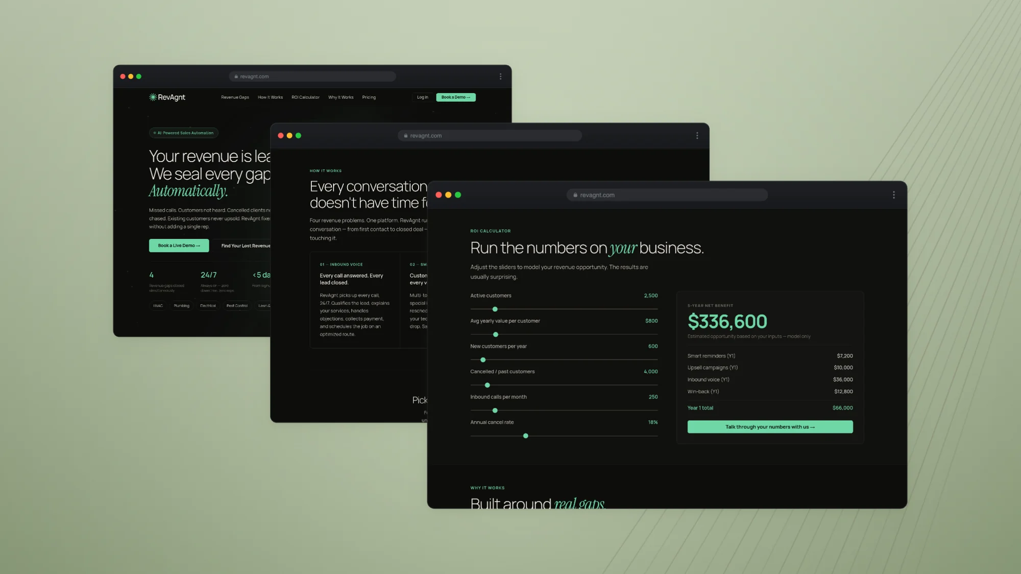
04An ROI calculator that runs on the operator’s own numbers instead of an industry average.
The lockup on light and on the near-black the product ships in. The mark carries sage on dark and deep sage on light — the same colour would disappear against a pale ground.
Logo / light
Logo / dark
The symbol
The burst alone, on its construction grid. Twelve rays at thirty-degree intervals, then the whole set rotated off axis so the symmetry never quite resolves.
Primary
Reversed
One colour
The mark
Twelve capsule rays, thirty degrees apart, swept off centre so the whole thing leans about eight degrees. It reads as something mid-turn rather than something finished — which is the product.
A symmetrical burst would have read as a sun, a sparkle, or every other AI logo shipped that year. The sweep is what makes it specific: it suggests a process already running, which is the argument the page spends the rest of its length making.
The wordmark
Manrope, set beside the mark rather than under it, so the name leads and the symbol follows. Tight tracking, no flourish — it has to survive being 90 pixels wide in a browser tab.
The capital A in the middle of “RevAgnt” is the one piece of character in an otherwise plain setting. It keeps both halves of the name legible at a glance, and stops the missing vowel from reading as a typo rather than a decision.
The palette
Sage against warm charcoal. Losses and problem figures carry in clay, never alarm red — the page is describing a leak, not an emergency.
That distinction does real work. Every competitor in the category leads with red urgency and a revenue number, and operators have learned to discount both. Clay lets the page name four expensive problems without raising its voice, so the numbers land as observation rather than pitch.
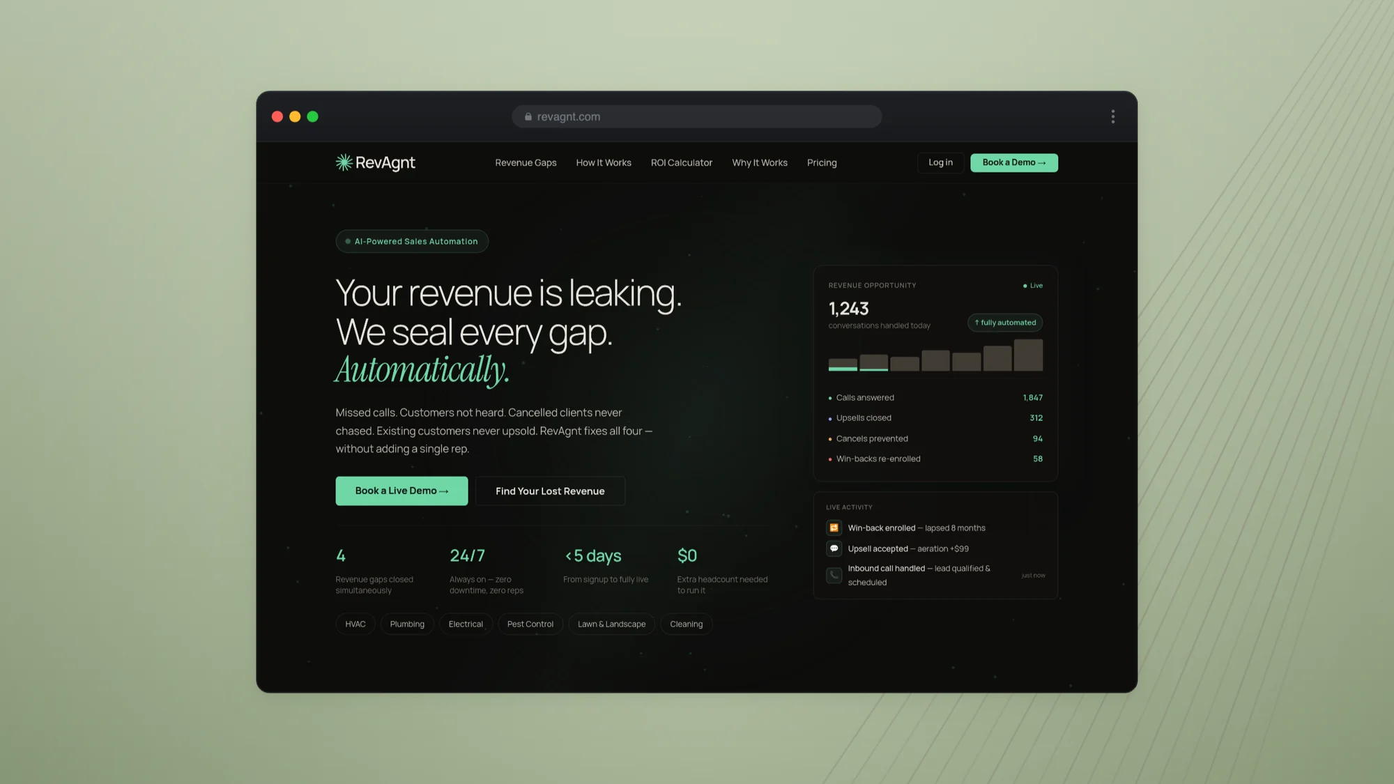
01
The claim, and the leak named underneath it
The page opens on what the product does — not on what it earns — and then immediately names the four places revenue goes missing. Nothing is held back for later: an operator knows inside five seconds whether this is about their business.
02
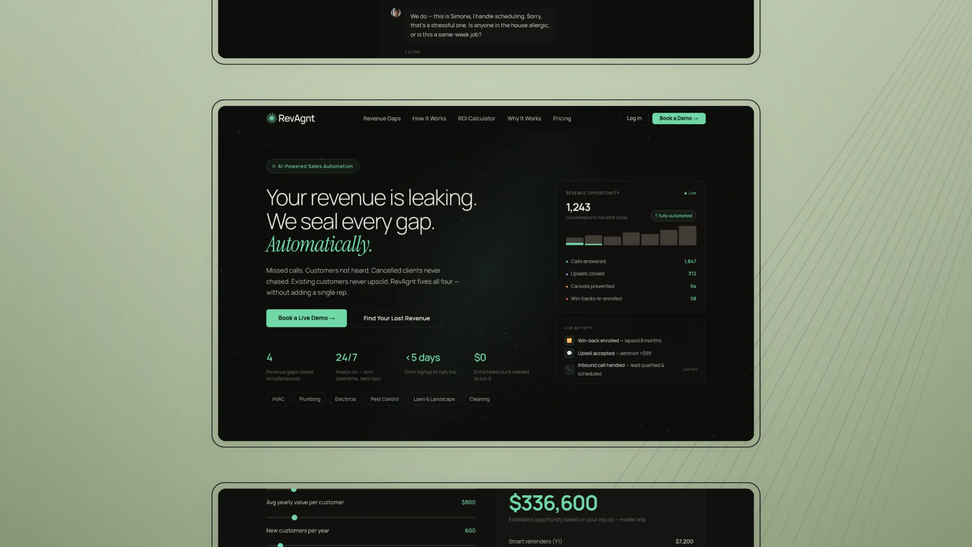
The demo does the arguing
Pick a trade and watch an agent take a real inbound call in that trade’s language. Four agents, each trained differently, one platform underneath. Nobody has to be told what the product does.
03
Then the numbers — and only then
The ROI calculator runs on the operator’s own call volume and ticket size rather than an industry average. It sits after the proof, so the figure it returns reads as arithmetic instead of a pitch.
04
The same argument at the same pace on a phone
Half of this traffic arrives from a phone between jobs. The mobile version keeps every beat — claim, demo, calculator, proof — rather than cutting the argument short.
05
The close
Pricing in the open, the objections answered directly beneath it, one booking link. Nothing stands between reading the page and starting a conversation.
Sage on warm charcoal, with every problem figure carried in clay
Every competitor leads with a revenue number. We led with what the thing actually does.