Context
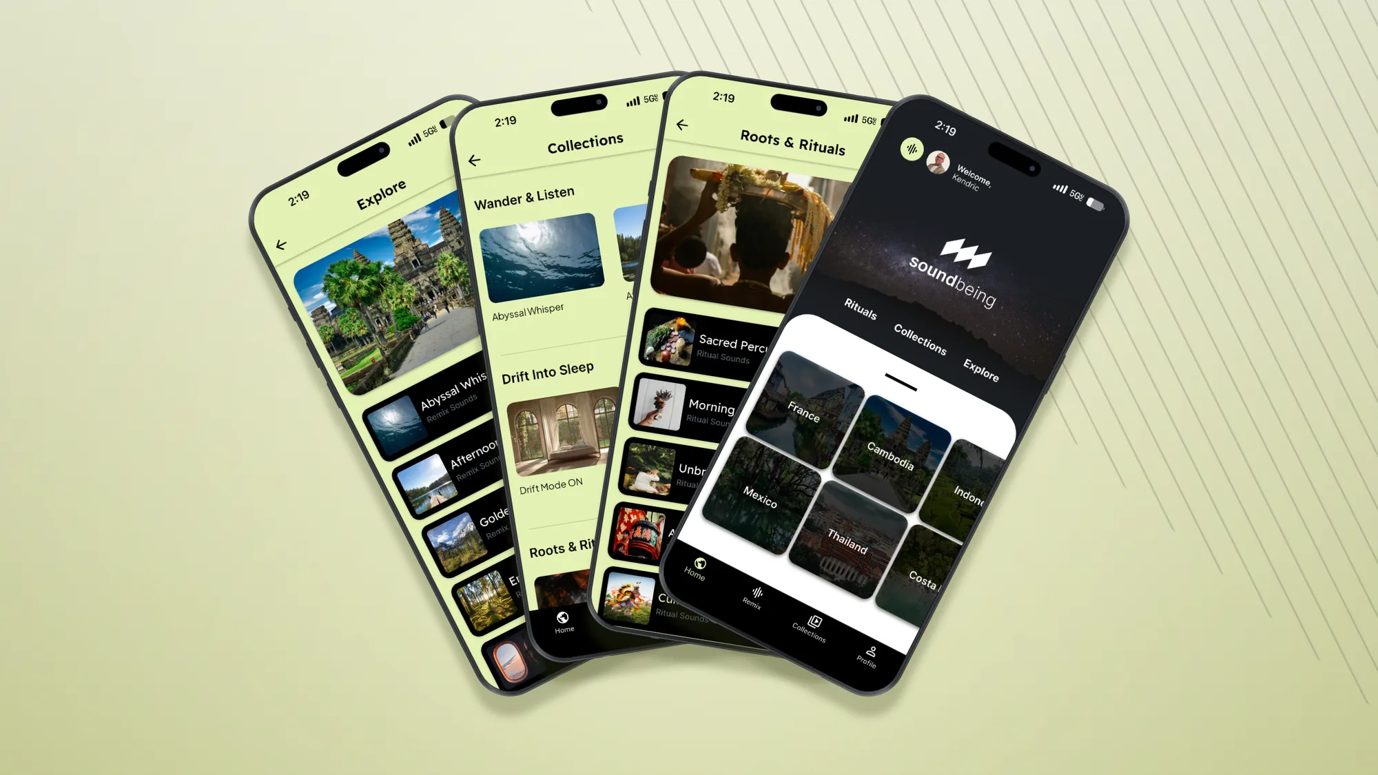
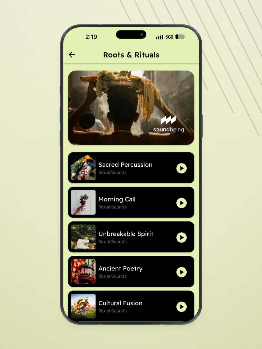
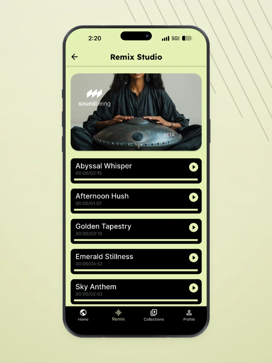
Most wellness apps treat sound as background — a library to scroll, a timer to set. Soundbeing starts from the opposite premise: that a soundscape carries a place, and that listening deliberately to one is closer to travel than to a playlist.
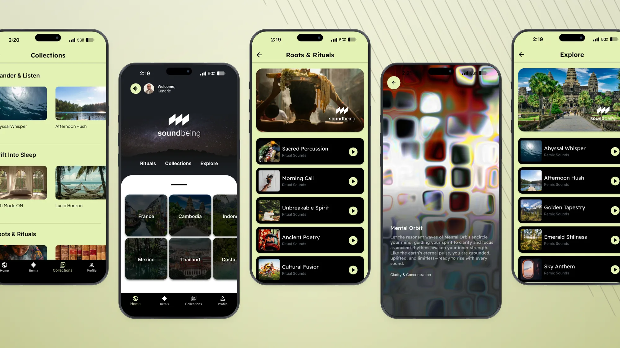
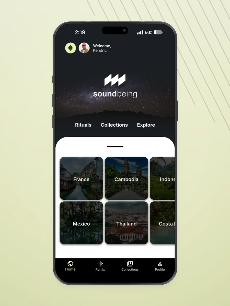
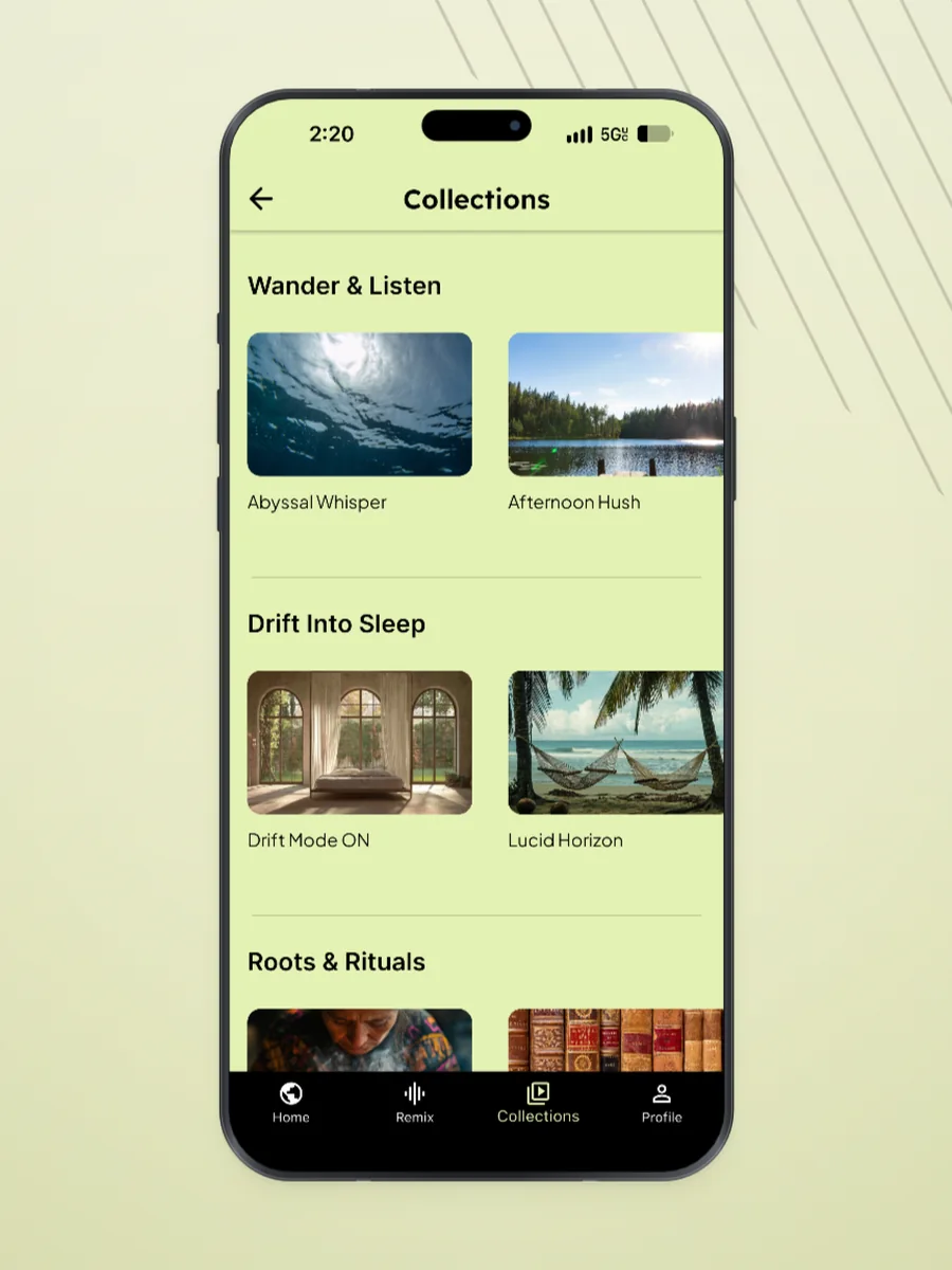
That idea had to survive contact with a real product. It shapes the vocabulary (rituals, collections, explore rather than tracks, albums, browse), the pacing of the interface, and the decision to lead with geography instead of genre.
Approach
I started with the identity, because the name and the mark set the register for everything after — calm, precise, unhurried, closer to a field recording label than to a meditation brand.
From there the product work ran in parallel with the system work. Every screen was built from a small set of components with consistent spacing, type ramp, and motion timing, so the app could grow without the experience drifting.
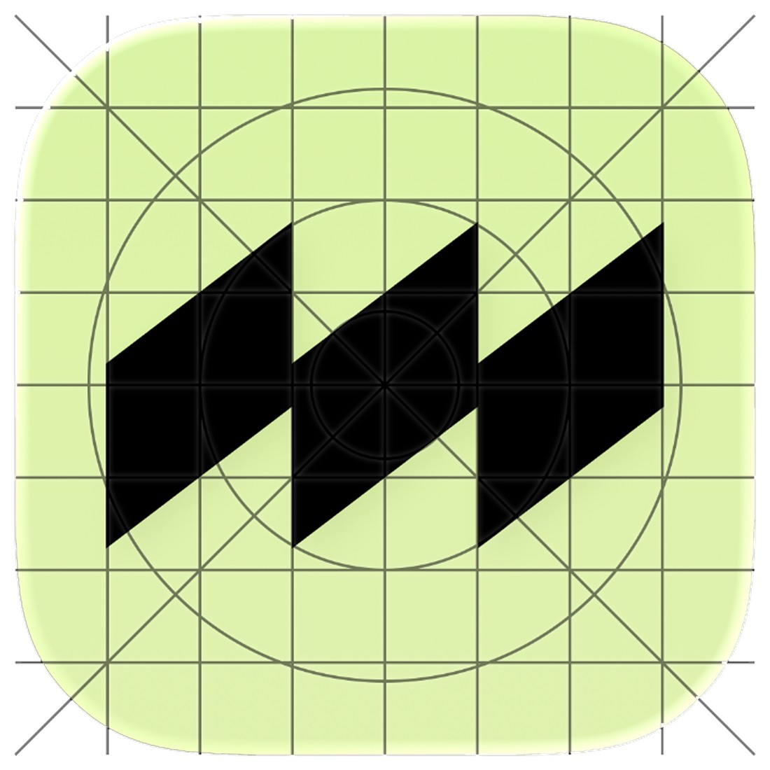
Three strokes, one waveform.
The mark is three offset parallelograms — a waveform reduced until only its repeat is left. Slanted so it reads as motion rather than as bars, and spaced so the counters stay open at small sizes.
Drawn on a grid inside the iOS superellipse, black on the brand lime, so it survives the jump from a 1024px store listing to a 29px settings row.
Lime
A soft, refreshing lime green that evokes a sense of renewal.
- HEX
- #E4F2B4
- RGB
- 228 242 180
- CMYK
- 6 0 26 5
Olive
A muted olive green that brings a natural, earthy calmness.
- HEX
- #B5BF8F
- RGB
- 181 191 143
- CMYK
- 25 0 40 25
Moss
Grounds and stabilises the palette with its rich, organic tone.
- HEX
- #71735B
- RGB
- 113 115 91
- CMYK
- 51 43 60 18
Cream
A warm, creamy off-white that radiates softness.
- HEX
- #F2F0CE
- RGB
- 242 240 206
- CMYK
- 5 2 18 0
Charcoal
A deep black charcoal that adds depth and sophistication.
- HEX
- #262221
- RGB
- 38 34 33
- CMYK
- 70 70 65 80
Inter
ABCDEF
abcd1234
ABCDEFGHIJKLMNOPQRSTUVWXYZ
abcdefghijklmnopqrstuvwxyz
0123456789 @ # $ % & *
AAAAAAAABlack → Extra Light
A soundscape carries a place. The product is built to make that the point, not a feature.